Is the Cedar Point Logo Changing?

djDaemon said:
It's pretty disingenuous to compare bourbons that cost 4 and 7 times as much to Maker's.
And you're using Booker's in a Manhattan?!?!? I love Manhattans, but it is blasphemous to consume Booker's in any way other than intended by the Bourbon Gods: neat.
Not really, if I compare a nice Audi to a mid tier Ford, the Audi wins. It's just better, you get what you pay for. Makers is decent, but spend a bit more (2-3x the amount, not 4-7) and you get a much better quality. Second, with Bookers giving you cask strength, you're also technically getting more proofed down (say in a Manhattan with a good Vermouth-not Martini, hell no) it actually opens up quite well. It's no different than bringing down the proof of Scotch with a few drops of water (like taking a bottle of Laphroaig cask strength). It's quite a great flavor in a drink.
Yes Bookers is pretty awesome neat, but give it a shot in other stuff, just use good stuff with it. My roommate once got a cheap ass bottle of Mr T's Manhattan mix to use with a drink once...He was almost shot :P
Corkscrew, Power Tower, Magnum, & Monster/ Witches Wheel Crew 2011

Y'all enjoy your classy drinks, I'll just take a nice Pina Colada. (The one I had from the Surf Lounge last season was excellent. Cute bartender, too.)
As for the new logo, meh. I don't HATE it, but the wavy green one was more playful in a very fitting way for an amusement park. (The 80s one will always be my favorite though. They were selling shirts with that logo at the Hat Rack last year and I snapped one right up. <3 )
Proud 5th Liner and CP fan since 1986.

thedevariouseffect said:
Not really, if I compare a nice Audi to a mid tier Ford, the Audi wins. It's just better, you get what you pay for. Makers is decent, but spend a bit more (2-3x the amount, not 4-7) and you get a much better quality. Second, with Bookers giving you cask strength, you're also technically getting more proofed down (say in a Manhattan with a good Vermouth-not Martini, hell no) it actually opens up quite well. It's no different than bringing down the proof of Scotch with a few drops of water (like taking a bottle of Laphroaig cask strength). It's quite a great flavor in a drink.
Yes Bookers is pretty awesome neat, but give it a shot in other stuff, just use good stuff with it. My roommate once got a cheap ass bottle of Mr T's Manhattan mix to use with a drink once...He was almost shot :P
I don't know man, those Fords are nice :)
Cedar Point Lifer
Employee 2006-2009

Sollybeast said:
Y'all enjoy your classy drinks, I'll just take a nice Pina Colada. (The one I had from the Surf Lounge last season was excellent. Cute bartender, too.)
She was a sweet person too. They had a really good staff at the Surf Lounge last year.
I'd rather be in my boat with a drink on the rocks,
than in the drink with a boat on the rocks.
Probably a different bartender you're thinking of, Pete. The one who made my Pina was a cute, friendly GUY. XP
Proud 5th Liner and CP fan since 1986.

The Kings Island logo also changed to the same style at the new CP logo. They're using it on social media.
1999: First visit
Halloweekends- Harvest Fear, Tombstone Terror-Tory
Ride Operations- Professor Delbert’s Frontier Fling

A quck run through the various Cedar Fair websites shows that most of the parks are using the new "flat" logo. Knott's isn't, but the Knott's logo is used on several products.
I'm a Marxist, of the Groucho sort.

I'm not seeing any new logos on any of these sites. The logos I'm seeing have been there for months if not years.
It was on instagram. I went back and looked and discovered it was a fan page using it. Sorry for the mistake.
1999: First visit
Halloweekends- Harvest Fear, Tombstone Terror-Tory
Ride Operations- Professor Delbert’s Frontier Fling
I love the entrance sign right at CP drive. It will look so bland if they replace it with this new logo. :(


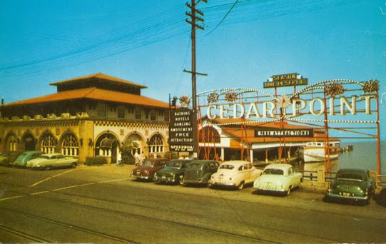
That sign was awesome in the vintage cheesey sort of way, like bubble lights and tinsel on Christmas trees or fake wood paneling on a station wagon.
This. If you look at the CF website, almost all the parks are using the same typeface. Much easier on printing and design costs, but each park looses a bit of soul due to it.

I have noticed many companies moving to more standardized fonts. Look at the NBA as an example.
Enjoy the rest of your day at America's Rockin' Roller Coast! Ride On!
Boring.
1999: First visit
Halloweekends- Harvest Fear, Tombstone Terror-Tory
Ride Operations- Professor Delbert’s Frontier Fling

CoasterKyle1121 said:
Boring.
The endless customerless hours at ‘The Fling’?
New for 2024- Wicked Twister Plus
You must be logged in to post